In this guide
Choose the words that must remain readableCompare real catalogue lettering, not just colourUse the 3D pen to inspect reading directionCheck physical scale before choosing a font sizeGive complex lettering room to breatheWhy this matters for current stationery projectsSend a readability brief with the quote requestA phrase that looks clear in an enlarged image can become difficult to read on a narrow pen. Before asking for a sample, separate three questions: can you recognize the lettering in the artwork, can you follow it around the curved surface, and will it print clearly at the agreed size? A free 3D preview helps with the second question. It cannot answer all three. Start with one must-read element, such as a name or short phrase, rather than trying to fit every detail onto the pen.
| Check | Useful for | Does not confirm |
|---|---|---|
| Flat artwork at confirmed dimensions | Letter spacing, spelling and hierarchy | Printing on the chosen pen surface |
| Rotating 3D pen preview | Reading direction and how a phrase turns out of view | Actual-size display or production accuracy |
| Agreed physical sample | Reviewing the supplied sample under normal use | Every future batch without an approved specification |
Choose the words that must remain readable
Write down the exact name or phrase first, including punctuation and capitalization. Decide whether someone should read it while holding the pen normally or turn the pen to follow it. A short word running along the body and a sentence wrapping around it create different reading tasks. For your own artwork, try a shorter message or give the essential words more space before adding small decorative details. Keep separate versions so regional support can see what changed; a screenshot alone is not an editable artwork file.
Compare real catalogue lettering, not just colour
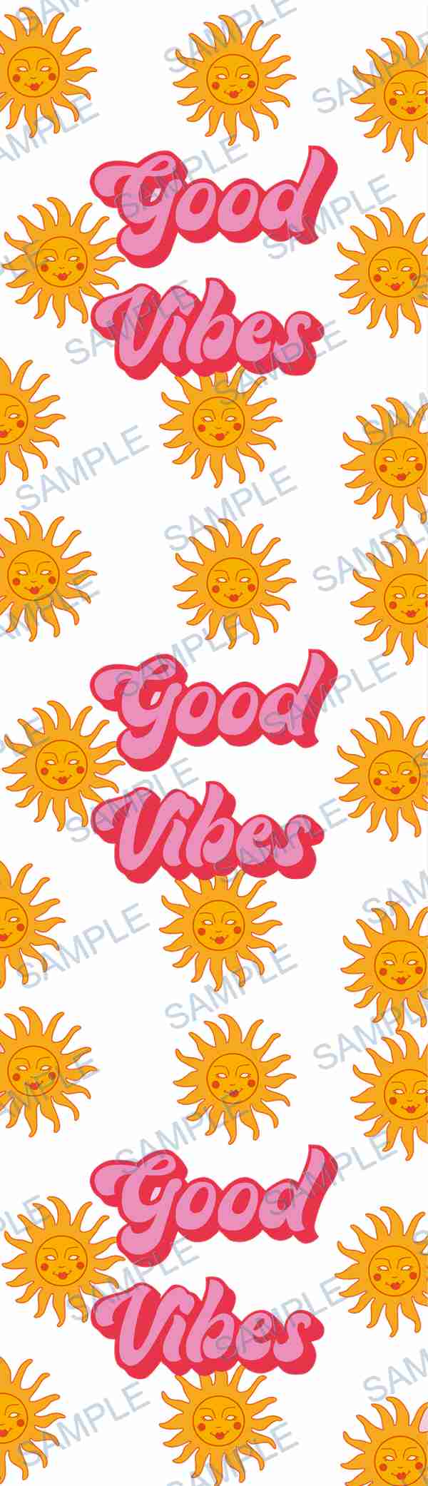
Use keyword search in the nearly 100k catalogue, filter for Pen Wrap, and try text or letters. Record each design code and quantity. P-329 below uses a repeated short phrase with a coloured shadow; P-409 includes slender white letter strokes on coloured blocks; P-20526 is an alphabet-and-number sheet with textured fills. These show different details to inspect, not a ranking of print quality. Check narrow strokes, spaces inside letters and the separation between letters and background. A catalogue thumbnail is a selection reference, not a production download. Do not remove its watermark or assume an alphabet sheet is already laid out as your requested name.
Use the 3D pen to inspect reading direction
Open the free 3D Product Preview, choose Pen Wrap, and enter a supported catalogue code or upload your own authorized image. Turn off auto-rotation when you want to study one side, then rotate the model to see where the important words disappear around the body. Note which part should face the reader. The current pen tool previews an image; it is not a letter-by-letter typesetting editor. Changing the scene background or lighting does not change the text in your artwork or prove its ink contrast on the final material. Send the original image or code with any marked-up preview screenshot.
Check physical scale before choosing a font size
Ask regional support to confirm the actual pen, usable decoration area, orientation and production method before finalizing dimensions. There is no single minimum font size suitable for every typeface and process. A phone zoom level or browser display at 100% is not a reliable millimetre measurement. For your own artwork, a paper print at the confirmed dimensions can help you judge reading effort: disable automatic fit-to-page scaling and verify a known dimension with a ruler. Treat that as a layout test, not a test of adhesion, colour, surface finish or production quality. Ask for the appropriate proof or sample when small text is essential.
Give complex lettering room to breathe
Do not assume the same point size makes Latin letters, Japanese characters and Korean syllables equally readable. Review the actual wording: small internal spaces and closely placed strokes deserve attention. Compare light text on a busy background with a simpler treatment of your own artwork, keeping the intended size unchanged. VOGRACE's September print-ready artwork guide also recommends checking small text and fine details at intended output size. It is useful preparation guidance, not an ARTETRIBE manufacturing specification. Confirm file requirements and any requested artwork revisions with regional support rather than applying another supplier's numeric limits to this order.
Why this matters for current stationery projects
US signal: Paper Source's July 3 planner collection highlights illustrated desk stationery. Japan signal: LOFT's autumn stationery festival runs August 29 to October 16. Korea signal: 10x10's current stationery page pairs a pen selection with September journal-decoration arrivals. These retail signals make coordinated stationery a relevant design context, but they do not measure demand for ARTETRIBE pen wraps. Use your own or authorized artwork, not another retailer's characters or designs. For a coordinated project, put the essential wording on the pen first and ask separately about any other product you want to match.
Send a readability brief with the quote request
Contact homepage regional support with the image or design code, exact wording, quantity by design, product type, production method, dimensions, packaging, deadline and destination region. Include which words must remain readable and any concerns found in the 3D preview. Request a fast quote, rapid sample support and small-batch customization; the available sample route, cost and timing must be confirmed for your project. Review the quote and agreed proof or sample, keep the approved artwork version, and complete order confirmation before production is arranged. The 3D view remains a direction check, not the final production proof.
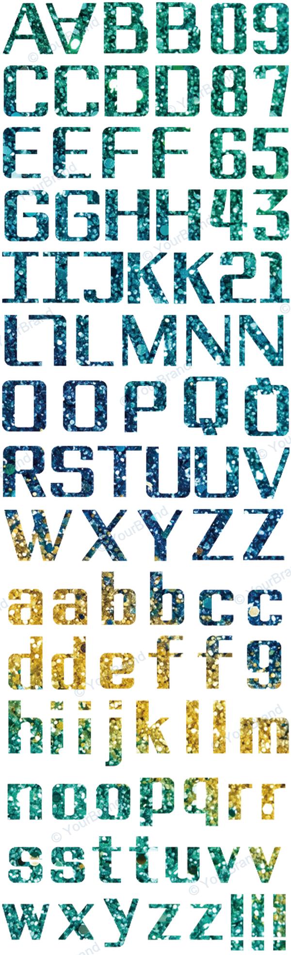 P-20526
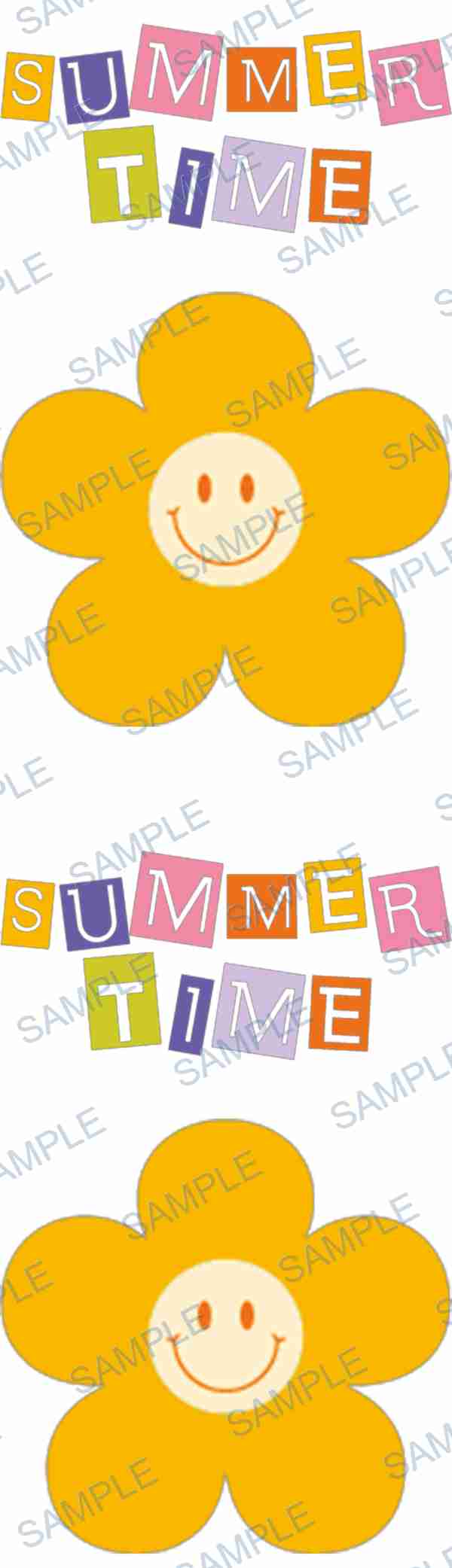 P-409
P-409Common questions
What is the minimum font size for a pen wrap?
There is no verified universal size for every pen, font and production method. Send the actual wording and intended dimensions to regional support. A physical sample may be appropriate when small lettering is important.
Does zooming in on the 3D preview prove the text will print clearly?
No. Zoom and screen size change how large the image appears. The preview helps with orientation and visual direction; it does not certify final-size readability or replace a production proof.
Can I edit individual letters inside the pen preview?
The current pen preview displays your image or a supported design code. It is not a typesetting editor. Make changes to your own source artwork or discuss the required adjustment with regional support.
Should I upload a catalogue thumbnail to create a name?
Keep the design code instead. Watermarked thumbnails identify designs and are not production downloads. Tell regional support the exact wording and ask what adaptation is possible; do not assume a letter sheet automatically becomes a personalized wrap.
What should I send for a small-batch quote and sample?
Send an authorized image or catalogue code, wording, quantity, product type, production method, dimensions, packaging, deadline and region. Ask for a fast quote and rapid sample support, then confirm the agreed specification and order before production is arranged.